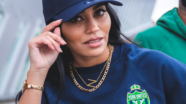
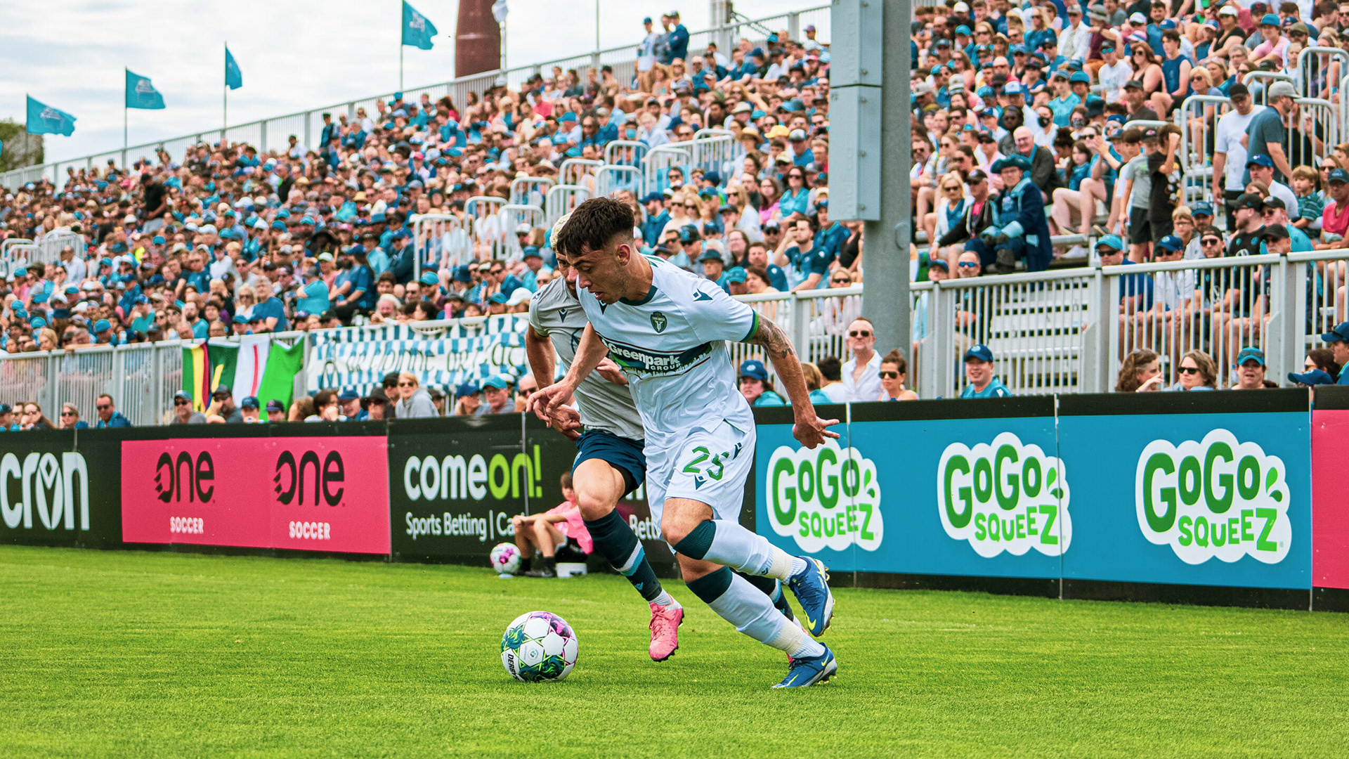
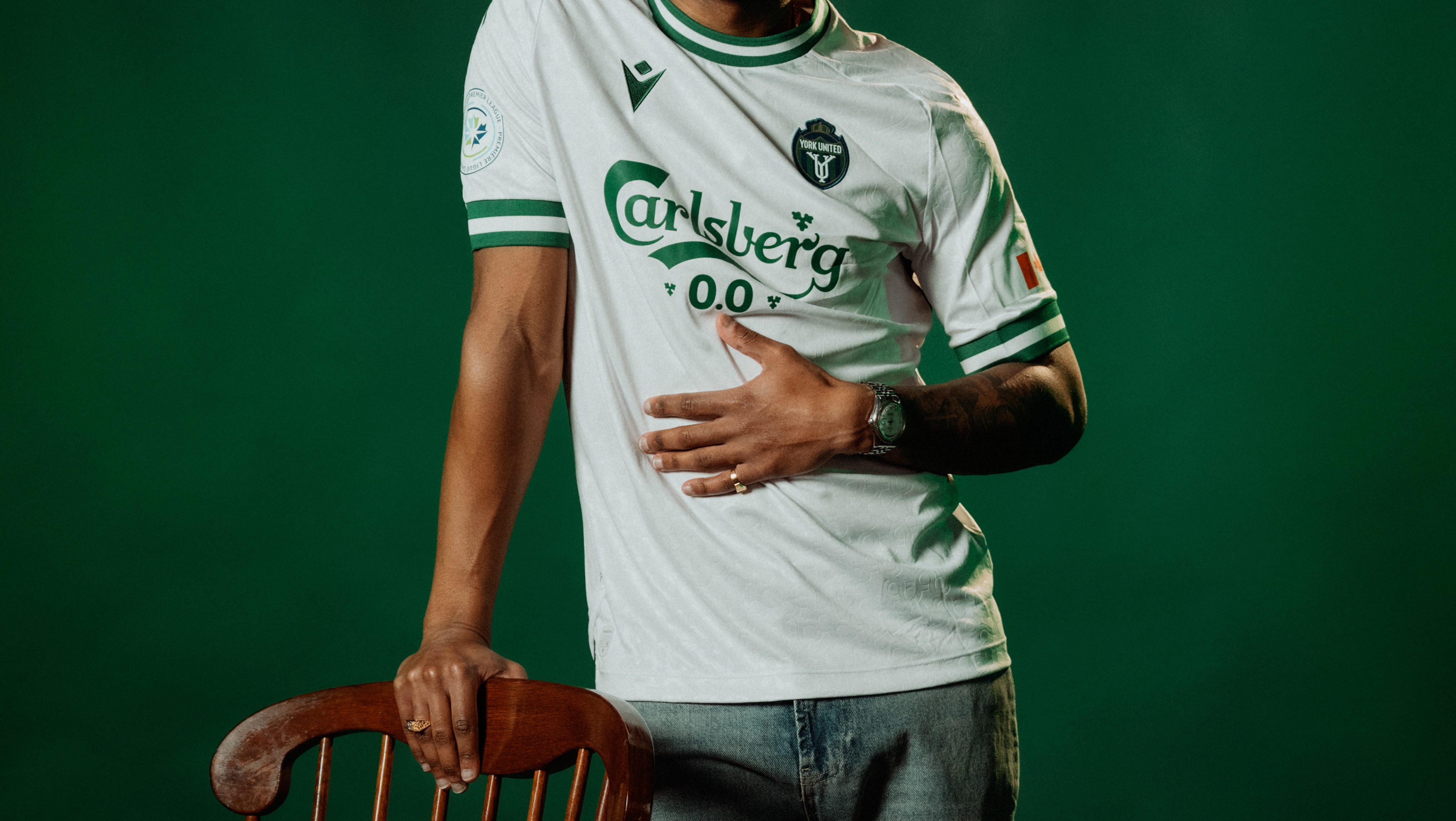
Formerly known as York9 FC, York United FC, is a club competing in the Canadian Premier League. As the lead graphic designer working at York United FC at the time. I was tasked leading the charge to rebrand the club.

Why Rebrand?
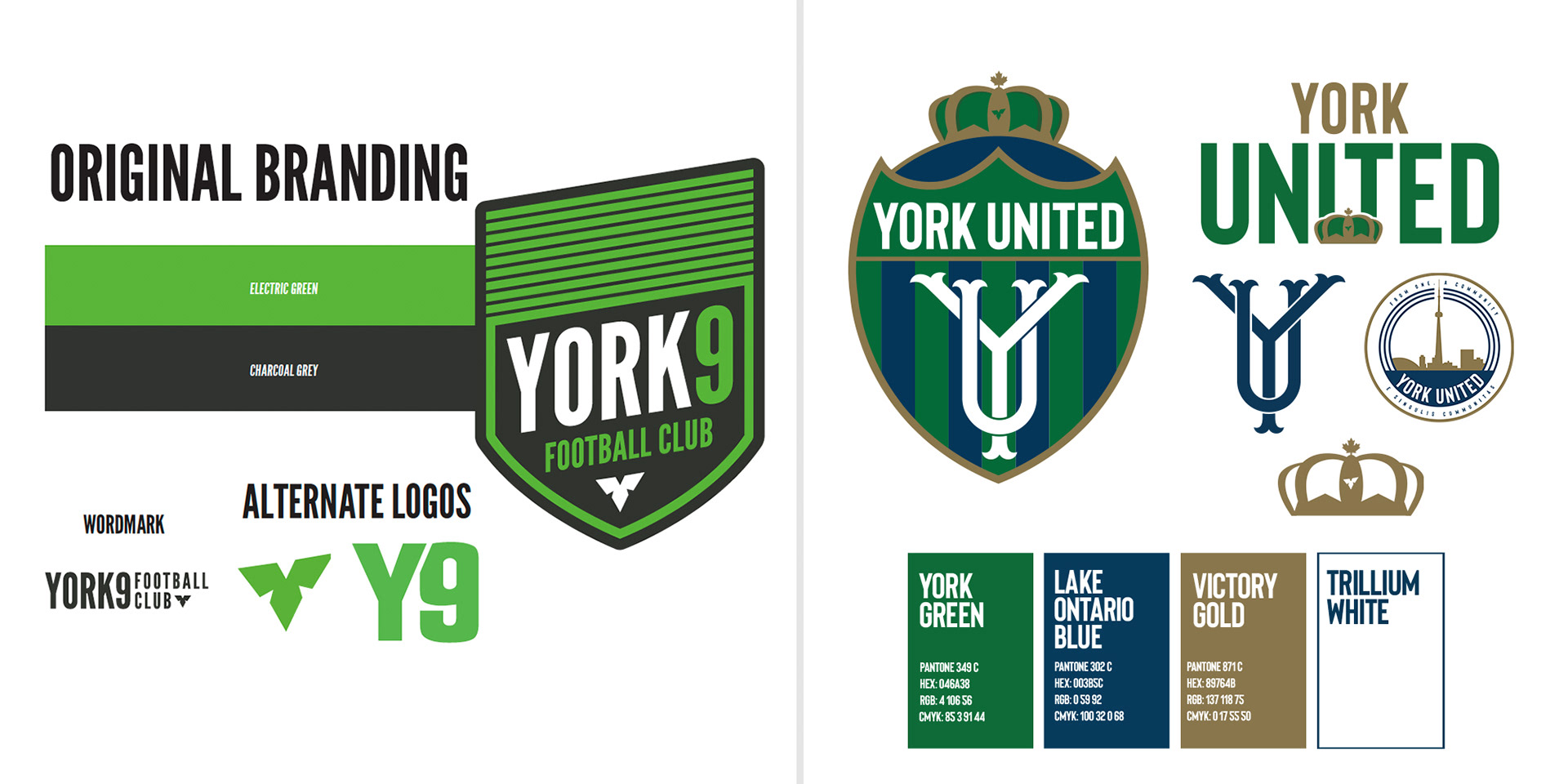
The York9 brand had many issues. From a design perspective a major flaw is the colour palette. The neon green was near impossible to match when looking at clothing manufacturers product lines. This meant we would have to get custom products built which would increase cost significantly. Not to mention Neon Green isn’t a very popular colour when it comes to apparel.
The brand also caused confusion in the marketplace. People did not understand the name. The original brand story of York9 was that the “9” represented York Region’s 9 municipalities. Being a soccer club was not the first thing that came to mind when people discovered the York9 brand, this was a very big problem.
Addressing the issues
To solve the issues above our marketing & leadership team laid down foundations for what we wanted to achieve.
Create a brand that is instantly recognizable as a soccer club.
Create a brand that resonates with all of Toronto – not just York Region.
Create a brand that has plenty of elements & versatility which can translate into merchandise seamlessly.
Carry over elements from the original brand, as it is part of the history of the club.